 Home — The hero moment
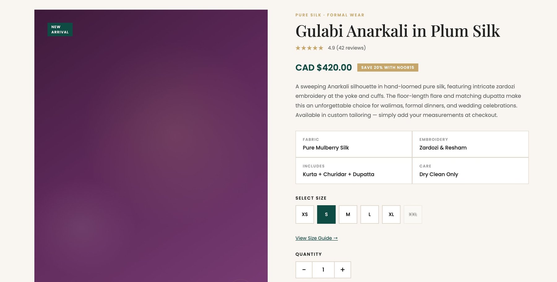 PDP — Gulabi Anarkali
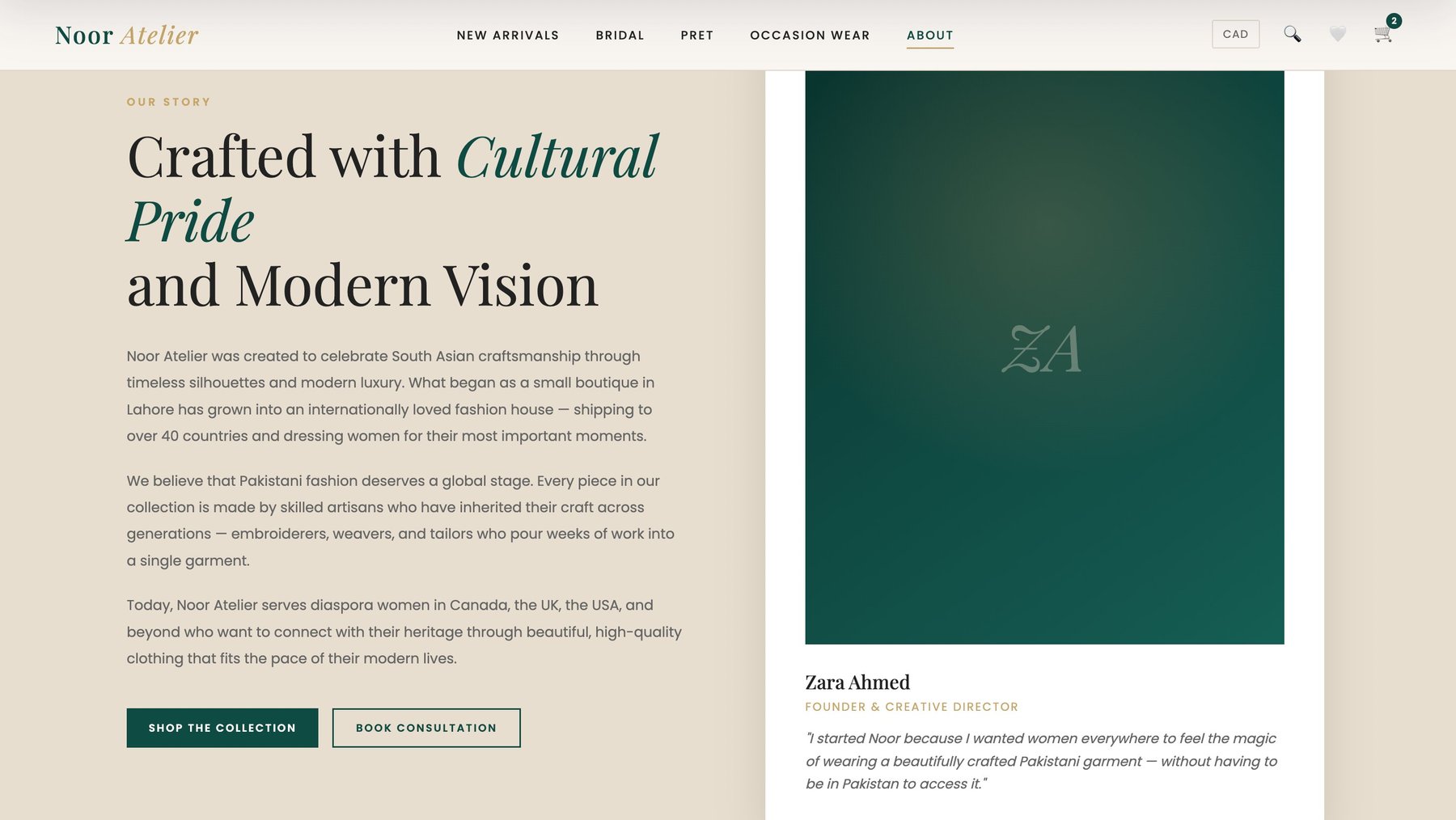 About — Our story
Noor Atelier needed more than a shop, they needed a digital atelier. I designed a full ecommerce experience for a luxury Pakistani fashion brand, where every pixel had to feel as considered as the hand-embroidery they sell.
Noor Atelier is a Pakistani luxury fashion label that lives and breathes craft. Handcrafted bridal couture, chiffon ready-to-wear, and unstitched lawn collections made by artisans who've been doing this for decades. It needed an online presence that reflected that.
The brief from the founders was simple and poetic: "The fabric is handwoven. The site should feel handwoven too." They wanted the experience of walking into their atelier in Karachi, that quiet, deliberate feeling where the clothes do the talking.
"We don't want a website. We want a digital atelier, somewhere our bride can fall in love with a piece before she's even touched it."
Beyond the vibes, there were real business goals to hit: grow bridal consultation inquiries, reduce mobile bounce, and help the lawn collection (their volume driver) actually convert on mobile.
Every interesting design problem has a few contradictions tucked inside. Noor had three I kept coming back to:
The thread connecting all three: the site had to feel like a considered welcome, not a hard sell. Luxury ecommerce leans on restraint, not urgency banners and pop-ups.
I started with what I always start with: listening. Before I opened Figma, I spent two weeks in coffee shops reading customer reviews, interviewing five returning buyers, and auditing competitors across both luxury Pakistani fashion (Sana Safinaz, Élan, Zara Shahjahan) and Western luxury (Jacquemus, Toteme, The Row).
What I found was a gap, the Pakistani sites over-indexed on festivity and felt crowded; the Western ones felt cold and culturally misaligned. The opportunity was in the middle: editorial restraint with cultural warmth.
From there, the process unfolded in five honest phases:
Home — The hero moment
PDP — Gulabi Anarkali
About — Our story
Home page. A full-bleed editorial hero pulls you in, followed by three soft tiles for each collection and a subtle newsletter popup offering 15% off — the highest-performing lead magnet I tested.
Collection pages. Large product imagery on a neutral canvas, quiet filter chrome, and a "Quick add" on hover for repeat buyers who don't need the full product page. Filters collapse gracefully on mobile.
Product detail. A two-column layout with a gallery that supports up to 8 shots, a collapsible fabric & care panel, and a size guide modal tuned for UK/Pakistani sizing. A small "Shipped in 5–7 days" micro-copy near the add-to-bag tested surprisingly well against cart abandonment.
Bridal experience. This one's my favourite. Instead of treating bridal like a shop, I designed it as a lookbook. Each gown has a "Book a Consultation" CTA that opens a calm, warm booking form because nobody adds a bridal lehenga to cart at 2am.
About page. An atelier story with portraits of the master craftsmen, a timeline of the brand, and behind-the-scenes photography from the workshop. This was the page that moved inquiries the most.
The quiet details do the heavy lifting. A serif italic in the right place says more about the brand than three paragraphs of copy.
The biggest lesson from Noor was that editorial restraint is a conversion tool. Most ecommerce instinct is to add. More trust badges, more discount banners, more urgency pop-ups. In luxury, the instinct is often inverted. Strip it back, let the product breathe, and trust grows naturally.
If I were doing it again, I'd push harder on motion. A few subtle reveals and gentle transitions would make the editorial feel even more alive. That's already on the roadmap for v2.
This project also reminded me that cultural context isn't a design afterthought, it shapes everything from category structure to form fields to how we commission photography. Designing for luxury is not the same as designing for this luxury, in this culture.