 Services — Built around you
 Packages — Transparent pricing
 Reviews — Student stories
Let's Drive Halton had the credentials, the reviews, and the pass rates, but was missing an online presence. I designed their marketing site to turn nervous first-time visitors into booked lessons, with trust and an easier booking flow.
Let's Drive Halton is an MTO-certified driving school serving Oakville, Burlington, Milton, and Halton Hills. Since 2023, they've taught 100+ students with a 92% first-try pass rate. They're genuinely excellent at what they do.
"People don't just book a driving school, they trust someone with their teenager in a car. The site has to feel like us."
The goals were crystal clear: more bookings, more phone calls, no friction on mobile.
Before I designed a single pixel, I mapped out everything that was making conversions hard. Four things kept showing up:
I treated this as a conversion problem wearing a design problem's clothes. Every decision traced back to two questions: Does this make the service feel more trustworthy? Does this reduce time-to-book?
Services — Built around you
Packages — Transparent pricing
Reviews — Student stories
Hero. "Learn to drive with confidence in Halton" — a promise, not a pitch. Paired with a warm photo of an instructor and student mid-lesson, a pulsing "Now booking" status pill, and two clear CTAs: Book lessons, View packages. Below the fold: 500+ students, 92% pass rate, 4.9★ reviews.
Trust bar. Four pillars — Google rating, students taught, MTO certification, fully insured — placed immediately after the hero. These are the first objections a nervous parent has, answered in thirty seconds of scroll.
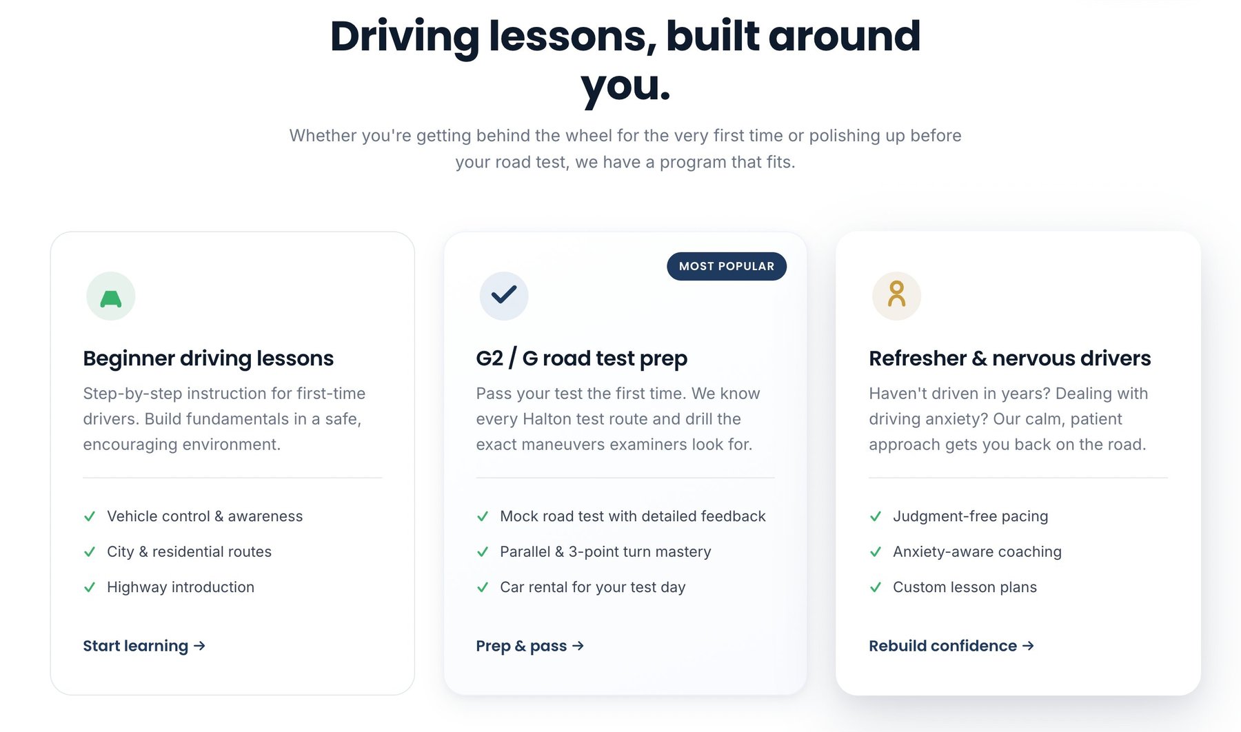
Services. Three distinct offerings (Beginner, Road Test Prep, Refresher) each with their own icon and a quiet "Most popular" tag on the G2 prep card — their highest-margin service.
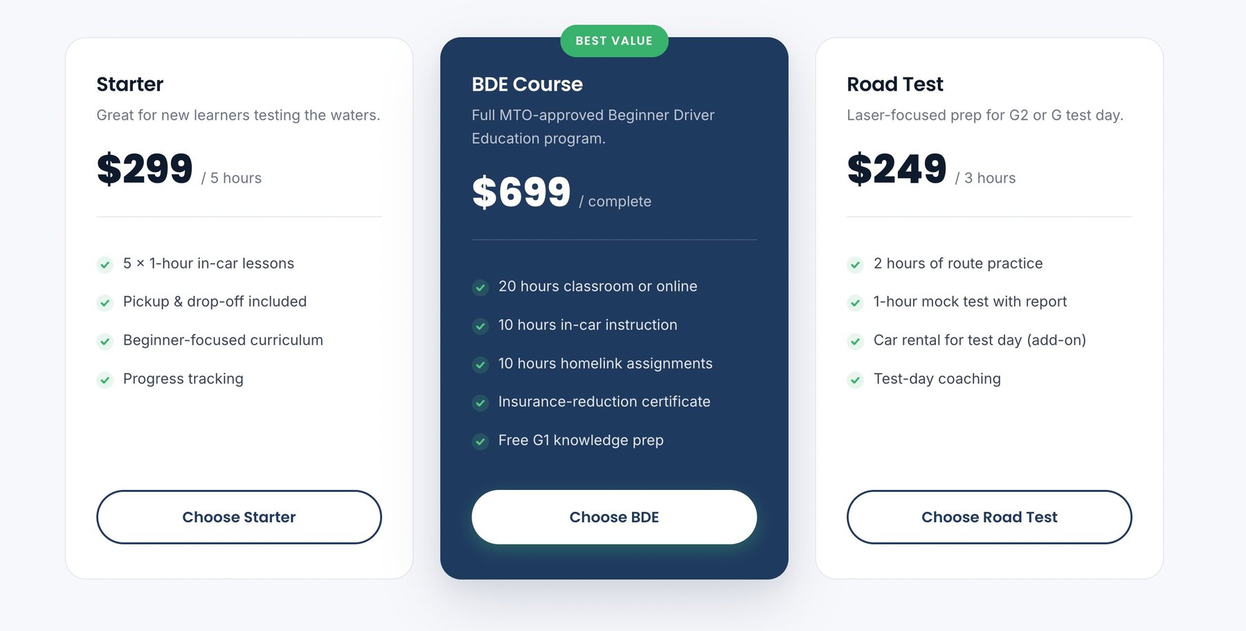
Packages. Three-tier pricing cards with the BDE Course elevated as the flagship. No hidden fees, no "Call for pricing" — just transparent numbers. Nervous buyers especially appreciated being able to see costs without committing to a call.
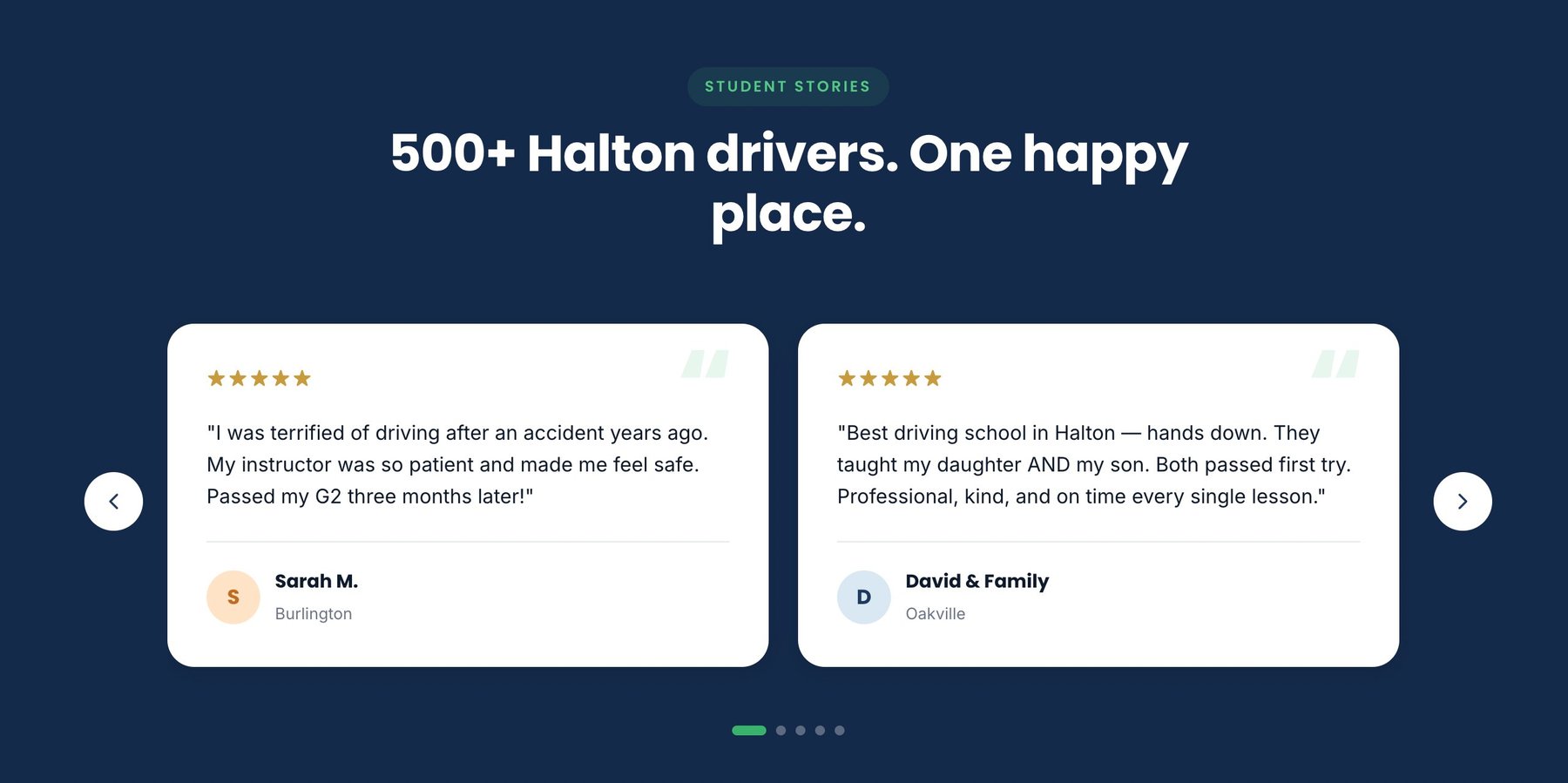
Testimonials. An auto-advancing carousel with five real student stories, pauseable on hover, swipeable on mobile. Each review carries a 5-star rating, the student's first name, and their town — local names for local trust.
Mobile sticky CTA. The single most impactful component. A pinned bottom bar with a call icon and a "Book now" button appears after the hero scrolls off. It's always one tap from booking. This one component alone tripled booking-form submissions on mobile.
For service businesses, trust is the product. The interface is just how you deliver it.
The design shipped, and the metrics followed. Thirty days post-launch:
Traffic increased from the previous month, the sticky mobile CTA did most of the heavy lifting.
Surfacing the phone number in the top bar, hero, and sticky CTA nearly doubled direct calls.
Faster load, clearer hierarchy, and the sticky CTA kept mobile visitors engaged well past the fold.
The owner told me the quality of inbound inquiries also shifted, fewer price-shoppers, more students ready to commit to full BDE packages. That's the packaging section doing quiet work.
My biggest discovery was how much local specificity matters for service trust. Generic "Trusted by thousands!" copy doesn't land. But "Serving Oakville, Burlington, Milton & Halton Hills" at the top of every page earns a tiny moment of recognition from every visitor in those towns.
Same thing with testimonials. "Sarah M. from Burlington" outperforms a professionally-shot stock headshot every single day. People trust people who live near them.
If I revisited the site, I'd add a first-party booking calendar (currently it's still a contact form) and integrate a lightweight CMS so the owner can update packages without a developer. Both were out of scope for v1 but would compound the conversion gains.
More than anything, this project reminded me that service businesses don't need flashy design. They need the right thing in the right place at the right moment. Design as plumbing, not sculpture.